
Showing posts with label Brief 1 - Ministry Of Sound. Show all posts
Showing posts with label Brief 1 - Ministry Of Sound. Show all posts
Wednesday, 30 May 2012

Ministry Of Sound Evaluation
This brief initially started out as a competition brief for D&AD to complete 3 typographic posters for Ministry Of Sound. I had always set out to submit the posters and then expand on the brief in order to fulfil if for the module submission and also, I wanted to incorporate packaging design into it as this is my main focus area of design.
With the initial brief set by D&AD, I felt that there were quite a lot of limitations and so the posters I submitted for the competition, although I was happy with them as I felt they suited the MOS brand and I felt I worked well to the brief mandatories, I didn't feel they suited me and the kind of work I usually produce. This meant once I had completed the posters for the competition submission, I felt very stuck for quite some time with how to expand on it. I then decided to pretty much start this brief over. I stuck with all my initial ideas and similar inspiration but scrapped all the mandatory requirements set by D&AD (such as colours) so I could produce something I felt suited me and my portfolio more. This was the best thing I could have done with this brief as I feel very happy with what i've ended up producing.
One thing that I'm very please with is due to the initial D&AD brief being in the typography category, it meant I had to be very type focused and so I produced my own typeface. I've always been interested in type but never created a typeface before and I'm actually very pleased with how it turned out. I feel this is good for my portfolio too as I now have another element to add to it to show I have a wider range of skills.
With the initial brief set by D&AD, I felt that there were quite a lot of limitations and so the posters I submitted for the competition, although I was happy with them as I felt they suited the MOS brand and I felt I worked well to the brief mandatories, I didn't feel they suited me and the kind of work I usually produce. This meant once I had completed the posters for the competition submission, I felt very stuck for quite some time with how to expand on it. I then decided to pretty much start this brief over. I stuck with all my initial ideas and similar inspiration but scrapped all the mandatory requirements set by D&AD (such as colours) so I could produce something I felt suited me and my portfolio more. This was the best thing I could have done with this brief as I feel very happy with what i've ended up producing.
One thing that I'm very please with is due to the initial D&AD brief being in the typography category, it meant I had to be very type focused and so I produced my own typeface. I've always been interested in type but never created a typeface before and I'm actually very pleased with how it turned out. I feel this is good for my portfolio too as I now have another element to add to it to show I have a wider range of skills.
Tuesday, 29 May 2012
Saturday, 26 May 2012
Friday, 25 May 2012
To Do
To do list for tomorrow:
- Finishing touches to Hannah's packaging and photograph it
- Photograph Ministry of Sound brief
- Re-take some of deli images
- Finish type posters
Once I have photographed all of the above I can then get on with putting together my final boards which I will be printing on monday.
- Finishing touches to Hannah's packaging and photograph it
- Photograph Ministry of Sound brief
- Re-take some of deli images
- Finish type posters
Once I have photographed all of the above I can then get on with putting together my final boards which I will be printing on monday.
Sunday, 20 May 2012


Saturday, 19 May 2012
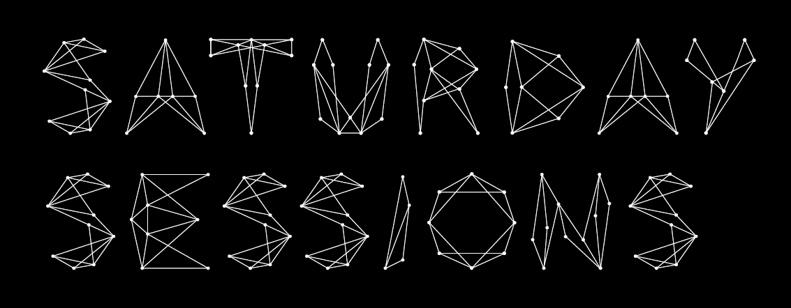

Creating The Background
As my typeface is inspired by star constellations I figured the best kind of background would be to create a night time sky effect.
Friday, 18 May 2012





Wednesday, 16 May 2012
Constellation Typeface


I do need to make few general adjustments to perfect the letters however i'm unsure on whether some of the letters actually work or not.
A lot of the letters are perfectly symmetrical which I think work really well however some of them which are impossible to make symmetrical seem to look a bit out of place.
Symmetrical letters:


Odd letters: Obviously these letters cannot be symmetrical like the above ones so I think they don't look too bad:


However there are some which just do not work and need developing into something that fits:


Monday, 7 May 2012
Timetable
This Week (7th-13th):
- Finish Deli brief and print
- Hannah packaging
- Yearbook
Next Week (14th - 20th):
- Add final images in yearbook
- MOS brief
Following Week (21st - 27th)
- Fashion branding brief
- Photography of finals
Following few days (28th-30th)
- Finishing touches
- Print boards (mon 28th)
- Any extra blogging
Self Motivation - I CAN DO IT!!!
- Finish Deli brief and print
- Hannah packaging
- Yearbook
Next Week (14th - 20th):
- Add final images in yearbook
- MOS brief
Following Week (21st - 27th)
- Fashion branding brief
- Photography of finals
Following few days (28th-30th)
- Finishing touches
- Print boards (mon 28th)
- Any extra blogging
Self Motivation - I CAN DO IT!!!
Sunday, 6 May 2012


Subscribe to:
Posts (Atom)