
Wednesday, 30 May 2012
SOI Evaluation
Looking back at my statement of intent and seeing where i've come:
I honestly feel my design practice had been quite focused for some time and so I have stuck to my statement of intent pretty well. I've known pretty much since second year that packaging design is the path i want to follow and third year has allowed to take this focus and really put my all into it. I've always felt a little embarrassed about showing my work off to people, but now im producing work I like and starting to feel proud of what i've done. I finally feel like my portfolio is coming together.
I stated that I wanted to focus more on the concepts behind my work and I feel I have done this in particular with my Waitrose brief and especially the YCN Graze brief.
Ministry Of Sound Evaluation
This brief initially started out as a competition brief for D&AD to complete 3 typographic posters for Ministry Of Sound. I had always set out to submit the posters and then expand on the brief in order to fulfil if for the module submission and also, I wanted to incorporate packaging design into it as this is my main focus area of design.
With the initial brief set by D&AD, I felt that there were quite a lot of limitations and so the posters I submitted for the competition, although I was happy with them as I felt they suited the MOS brand and I felt I worked well to the brief mandatories, I didn't feel they suited me and the kind of work I usually produce. This meant once I had completed the posters for the competition submission, I felt very stuck for quite some time with how to expand on it. I then decided to pretty much start this brief over. I stuck with all my initial ideas and similar inspiration but scrapped all the mandatory requirements set by D&AD (such as colours) so I could produce something I felt suited me and my portfolio more. This was the best thing I could have done with this brief as I feel very happy with what i've ended up producing.
One thing that I'm very please with is due to the initial D&AD brief being in the typography category, it meant I had to be very type focused and so I produced my own typeface. I've always been interested in type but never created a typeface before and I'm actually very pleased with how it turned out. I feel this is good for my portfolio too as I now have another element to add to it to show I have a wider range of skills.
Graze Evaluation
I'm really pleased with how this brief turned out, and i'm happy I have submitted it to YCN. I always think the pressure of entering a competition brief means you try harder and try to produce work to a higher standard, purely for the reason you are competing against so many others and also the pressure that so many people could end up viewing your work.
As this was the first brief I fully completed due to the competition deadline, it gave me that push to work harder on the rest of my briefs to get them to this stage by working at a quicker pace. I always seem to start off briefs very slowly before I get round to designing and developing, but due to this brief (and D&AD) both having tighter deadlines, I learnt that it is much better to move quickly. I gained more confidence from working like this as I proved to myself that I am capable. I also found that working at this quicker pace means you get the time to make mistakes, learn from them and they can still be resolved, rather than running out of time. It also means your briefs don't drag out and you don't end up getting bored which I have found in previous modules.
I felt when I initially started this brief that there wasn't actually too much you could do with it due the the brief restrictions being quite tight (you couldn't change the format of the packaging etc) however I feel what I came out with was very concept driven as well as focusing on the visual aspect so this made me feel I had took the brief further than just a simple re-design.
Yearbook Evaluation
I think the yearbook brief has been the ultimate learning curve for me, yet been so rewarding to have completed. Initially pitching for the graphics yearbook, I really wanted to take part in a real life brief that was representing part of the college and that would 100% be existing in the real world and so being picked for the fashion yearbook I felt was such a great opportunity.
This was my first brief in which I have ever worked for a client so it was quite nerve wracking as it's such a big thing for the college, however working with others gave me that bit more confidence to take it on and also completing it as part of the course meant I also still had that bit of security behind me if things didn't ever go quite to plan.
Editorial and layout isn't my usual area I focus in so I found this brief taught me a lot. I've definitely learnt quite a few more skills in InDesign which I didn't have before. And i've also learnt how relying on other people (the fashion students) in order to actually complete the work can be very stressful. We had many problems in receiving images and information which put a lot more pressure on us as we had to complete the book in quite short period of time. However I think we did rise to the challenge very well which made it a lot more rewarding in the end.
Due to it being a real live brief meant there was a lot more pressure for everything to be completely perfect. This was good in the sense that it never allowed me to cut corners and also meant I was working to complete things at a higher standard, yet the responsibility of this meant it was quite a stressful time.
I think we worked well as a team when it came down to the fun stuff such as experimental work and design decisions, however when it came down to putting the effort in to get things completed and organised there were some who took on more responsibilities than others. I've learnt collaborations are a lot harder in groups larger than two and would prefer to not work with this amount of people again as it got a bit confusing at times trying to make sure everyone knew what was going on.
Over all I feel we all should be very proud to have completed this brief. The experience of working on something so important and also for a real client has actually made me feel a lot more confident for finishing the course and doing this as my future.
Tuesday, 29 May 2012
Fashion Packaging Evaluation
Although this was only a very quick brief, I am happy with the results. Due to my main focus being packaging design, I was asked by Emma Cooper if I wanted to join her and her fashion student Hannah Wakeford in creating packaging for Hannah's submission. As I wasn't doing any kind of fashion collaboration I instantly said yes.
The brief was quite simple as Emma had already created all the branding so I designed and created the packaging to go with this meaning logos and colours created by Emma were part of my mandatory requirements.
It was really fun to work on and actually having a real client was a good for experience although I did find producing work for someone else to have was quite nerve wracking. I knew it had to be fully functional and perfect as there is no escaping any mistakes with the use of good photography!)
Hannah was really pleased with the finished piece which is always a confidence boost, however it was quite sad to have created this to then hand it over to someone else and not have it as your own, I guess this is something I will need to get used to though as it is how a lot of things work in this kind of industry. I made sure I photographed well for my portfolio and i'm really please how this looks.
Monday, 28 May 2012
Hannah Packaging Photos
Today me and Emma photographed Hannah's box packaging along with some of the branding Emma had done so she could also use it for her submission and portfolio.
Context Publication
I've printed my cover onto kraft card, i'm yet to bind my book so here is a mock up of how it will look once its put together:


Sunday, 27 May 2012
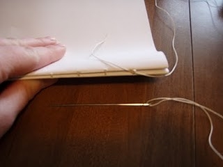
Context Binding
I want to use spiral binding for my context but to make it look a bit different, it's not going to be bound down the whole side, but split into 3 spirals evenly spread.
I've been in contact with a few binders in Leeds but can't find anywhere that can spiral bind with the gaps so I'm going to attempt it myself!
I've taken a spiral out of an old sketch book I had and cut it up into 3 small spirals:
(add photos)
I will need to measure the holes out quite precisely so the spiral fits perfectly to my book. I dont have time to laser cut now so I will very carefully hole punch my pages (I hope this works out!)
Spiral Binding
I actually really like spiral binding when it's in the right context. I particularly like the example below with the kraft cover notebook. I feel throughout this year quite a bit of my work has used kraft card and so this might be a good idea for my cover!


I think this idea above of separate spirals looks awesome!


Saturday, 26 May 2012


Packaging Net
So the packaging for Hannah needs to fit A3 sized sheets inside. She has measured the amount of work she has and has told me the depth needs to be 12cm in total.This is split into 3 separate sections so 4cm each.
Here is the net I have created for the 3 inside boxes along with the measurements i've calculated.

The stock i have ordered comes at 720mm x 1020mm which is perfect!
Friday, 25 May 2012
To Do
To do list for tomorrow:
- Finishing touches to Hannah's packaging and photograph it
- Photograph Ministry of Sound brief
- Re-take some of deli images
- Finish type posters
Once I have photographed all of the above I can then get on with putting together my final boards which I will be printing on monday.
- Finishing touches to Hannah's packaging and photograph it
- Photograph Ministry of Sound brief
- Re-take some of deli images
- Finish type posters
Once I have photographed all of the above I can then get on with putting together my final boards which I will be printing on monday.


Thursday, 24 May 2012
Final Crit Boards
I didn't get chance to add my written content to my boards yet and also i'm finishing my printing for Ministry Of Sound tomorrow in which I can then photograph my work for my boards instead of just artwork.
Wednesday, 23 May 2012
Waitrose New Photos
I've taken a few new photographs of the Waitrose range to add in my new products:


You can see here the hessian bags are very very small! However they do fit the spice jars perfectly which looks quite good.


You can see here the hessian bags are very very small! However they do fit the spice jars perfectly which looks quite good.


I also re-photographed the bottles as my last images of these didn't turn out too great:


Subscribe to:
Posts (Atom)